

Accommodations Engine
Creating a centralized system to upload, store, and view accommodations
Accommodations Engine
Creating a centralized system to upload, store, and view accommodations
Role
Designer &
Front-end Dev
Timeline
Jan - Apr 2025
Team
1 Lead / backend
2 Full-stack devs
2 Designers
Skills
Product Design
Interaction Design
Prototyping
Table of Contents
Summary
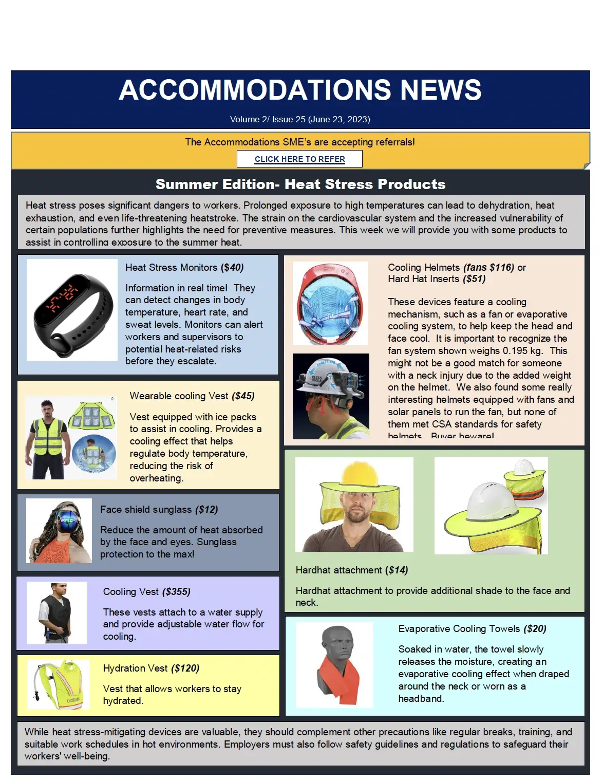
The Accommodations Engine is an internal tool we built to help Return-to-Work Specialists quickly and easily find the right accommodations for injured workers. Designed specifically for their workflows, this searchable database reduces the time and effort it takes to locate and manage accommodation options.
My Contributions
During this project, I worked as both a UI/UX designer and a front-end developer. Since this was a project started by the previous cohort, we were responsible for expanding scope, refining user experience, and bringing mid-fi designs to a production-ready state. Some of my contributions included:
Problem Context
RTW Specialists. Who are they?
Return to Work (RTW) Specialists at WSIB help individuals return to work after a workplace injury or illness.They meet with employers, injured individuals, and representatives to coordinate safe RTW plans and educate them on RTW policies and practices.
A critical aspect of their job is to find and assign suitable accommodations for injured workers. However, there is a giant roadblock in their process of finding accommodations:
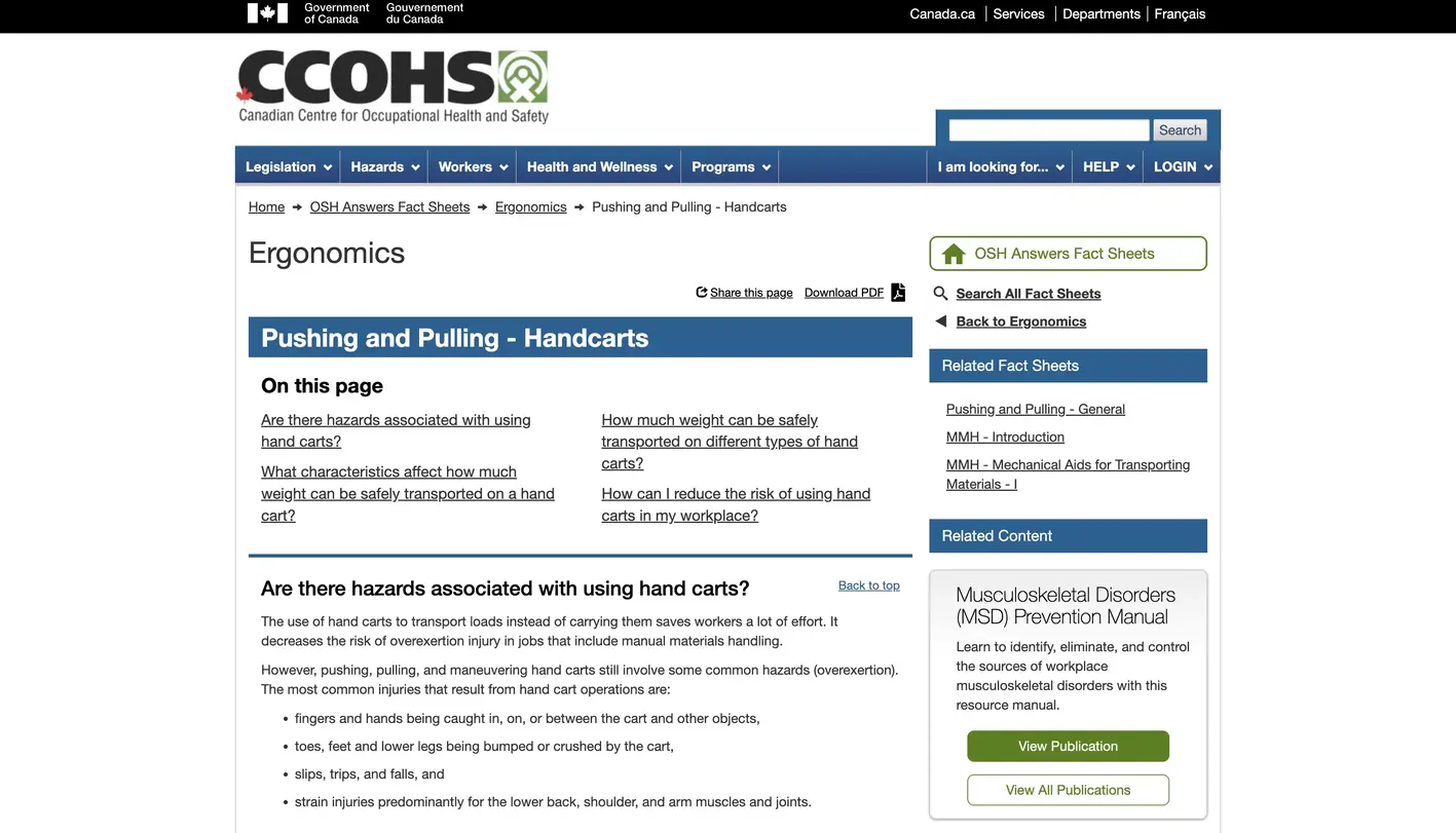
Currently, there is no standardized system for storing accommodations
Accommodations are scattered across different formats and systems like PDFs, websites, and Sharepoint tables. This makes finding accommodations incredibly inefficient and time-consuming.
User Research
On average, RTW specialists check 5 different applications and systems each time they search for an accommodation
To learn more about the current challenges, we held user interviews with RTW specialists, managers, and stakeholders, where we were able to find 3 main pain points that RTW specialists suffer from daily:
Pain point #1
Scattered accommodations make it time-consuming to go through
Pain point #1
Inconsistent formats make it hard to find necessary information
Pain point #1
There is no way to search or filter through all accommodations
Additionally, we gathered 3 critical user needs for our product:
User need #1:
Be able to quickly find accommodations by:
- Having a standardized format for displaying information
- Being able to search and filter accommodations based on names and tags
User need #2:
Find the best possible accommodation by:
- Understanding what the accommodation does
- Knowing what situations an accommodation applies in
- Knowing where to buy the accommodation from and how much it will cost
User need #3:
Effortlessly add accommodations to the engine by:
- Making the accommodation upload process as quick and simple as possible
- Being able to link the accommodation to the source it came from
From the information we gathered from our interviews, we landed on the question:
How might we help RTW Specialists at WSIB easily find, manage, and add accommodations using a centralized, intelligent tool?
Design Iterations
Notable design explorations
The previous cohort laid the groundwork with low-fi and mid-fi designs. Our job was to build on that foundation by expanding the feature set and refining the experience to create a production-ready product.
The following are three key areas I focused on.
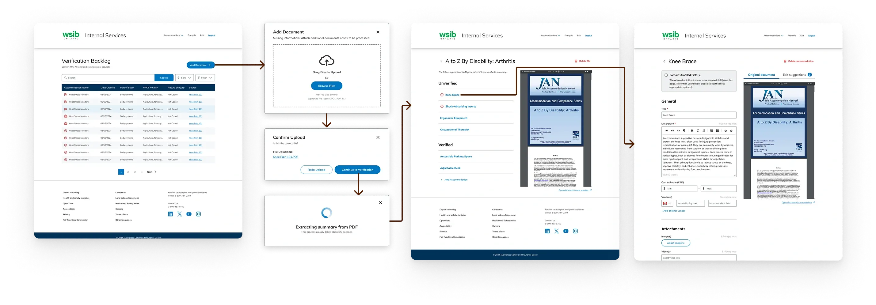
1. Simplifying the accommodation upload process
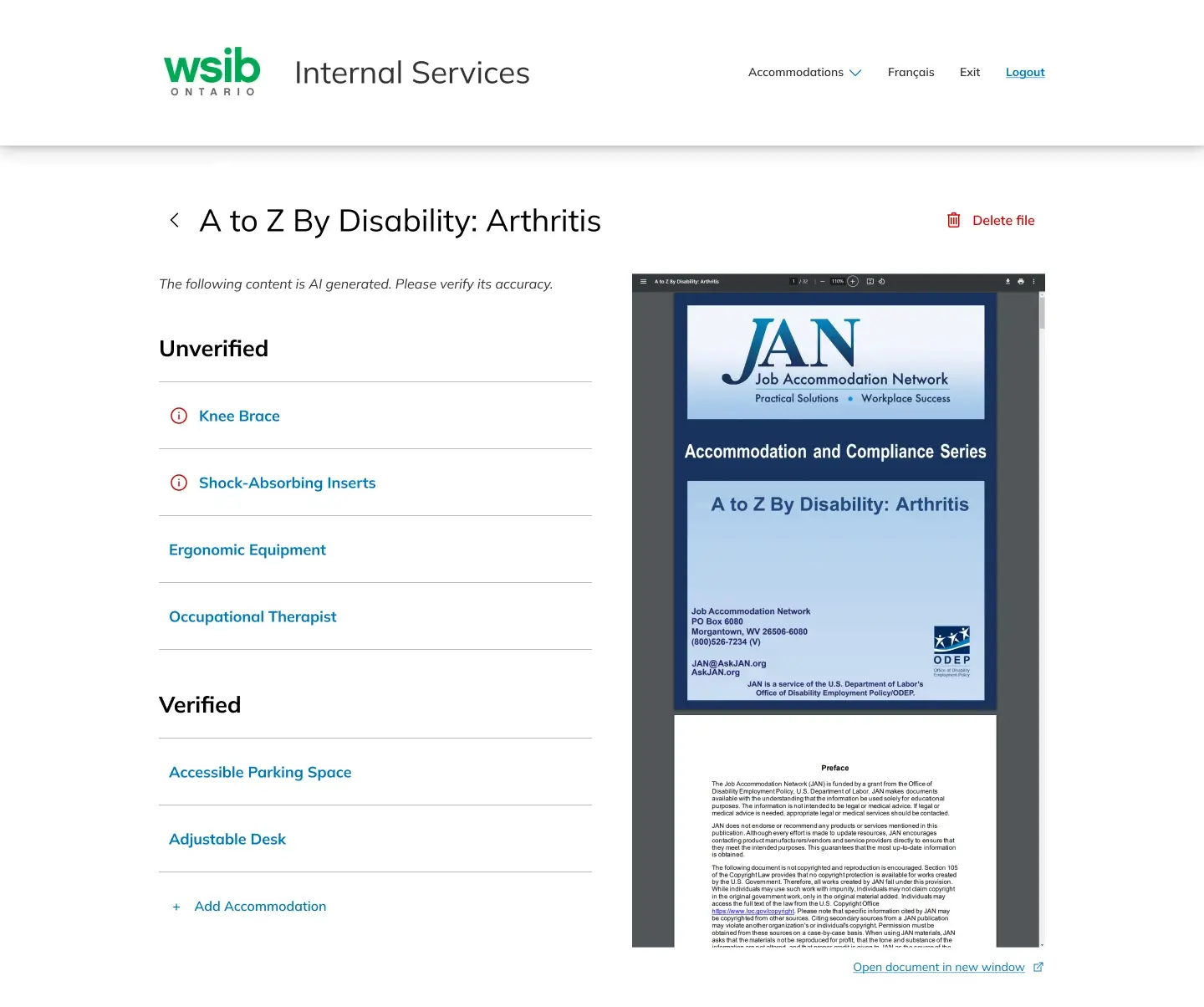
The user has to upload documents and websites to our software, where our AI extracts the accommodations it finds and adds them to the Verification Backlog where the user can then edit. However, the original upload process shown below sparked confusion with testers.
Original Flow:
Friction Points
The Source Overview page (shown right) caused too much confusion, namely:
- What’s the next step?
- The page doesn’t guide the user through the upload process
- Should they edit all the accommodations here or go back to the backlog?
- No duplicate accommodation handling
- How can users tell what accommodations are duplicates
- What should the user do with the duplicate?
- Unclear error states
- What does the error state mean?
Iteration 1: Adding an initial duplicate page
Adding a preceding page to force the user to keep or delete duplicate accommodations
Pros
- Segmentation of duplicates
- Can review what the duplicate accommodation looks like
- No more warning icons
Cons
- An extra page is too complex for users
- Unclear what clicking duplicate link does
- Still doesn’t tell what the user to do once they reach the Source Overview page
Iteration 2: Compressing the flow to one page
Creating a new section in the source overview page for the duplicate accommodations
Pros
- Only one page
- A bit more written instructions for the user
- Segmentation of duplicates
- Can review what the duplicate accommodation looks like
Cons
- Unclear what clicking duplicate link does
- Too many options for the user on this page
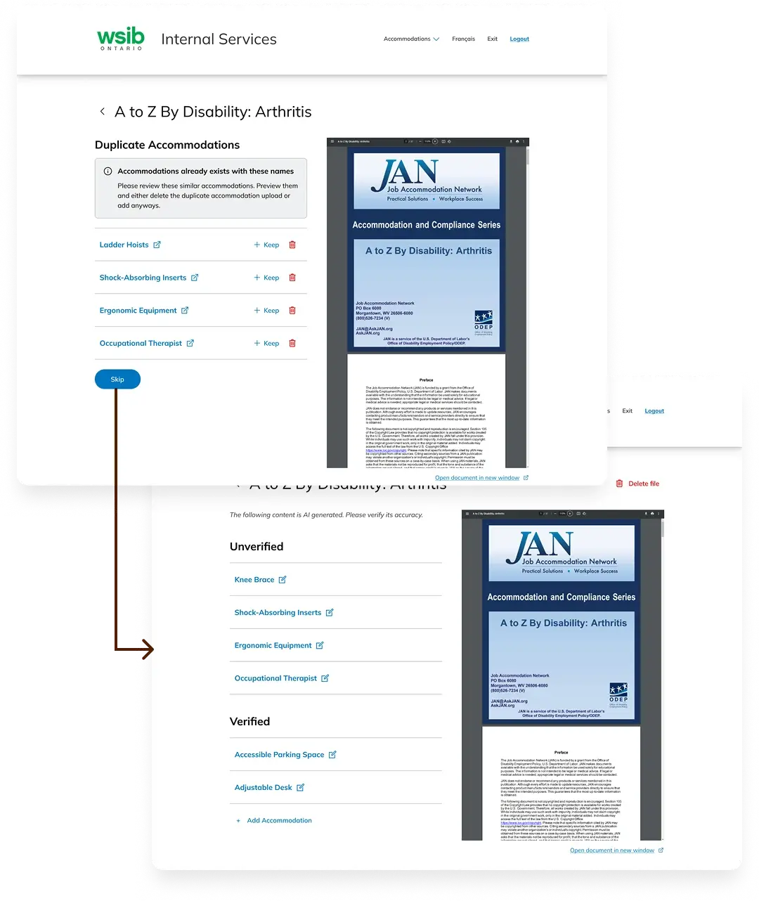
Final Design: Removing editing ability
Turned this page into a upload review page, instead of a document overview page by removing editing links. We also added a section to handle duplicate accommodations.
Pros
- Segmentation of duplicates
- Can compare duplicates side by side
- Simplifies the flow for the user and makes them return to the backlog to edit
- Clear instructions on what to do
- Well labeled warning icon
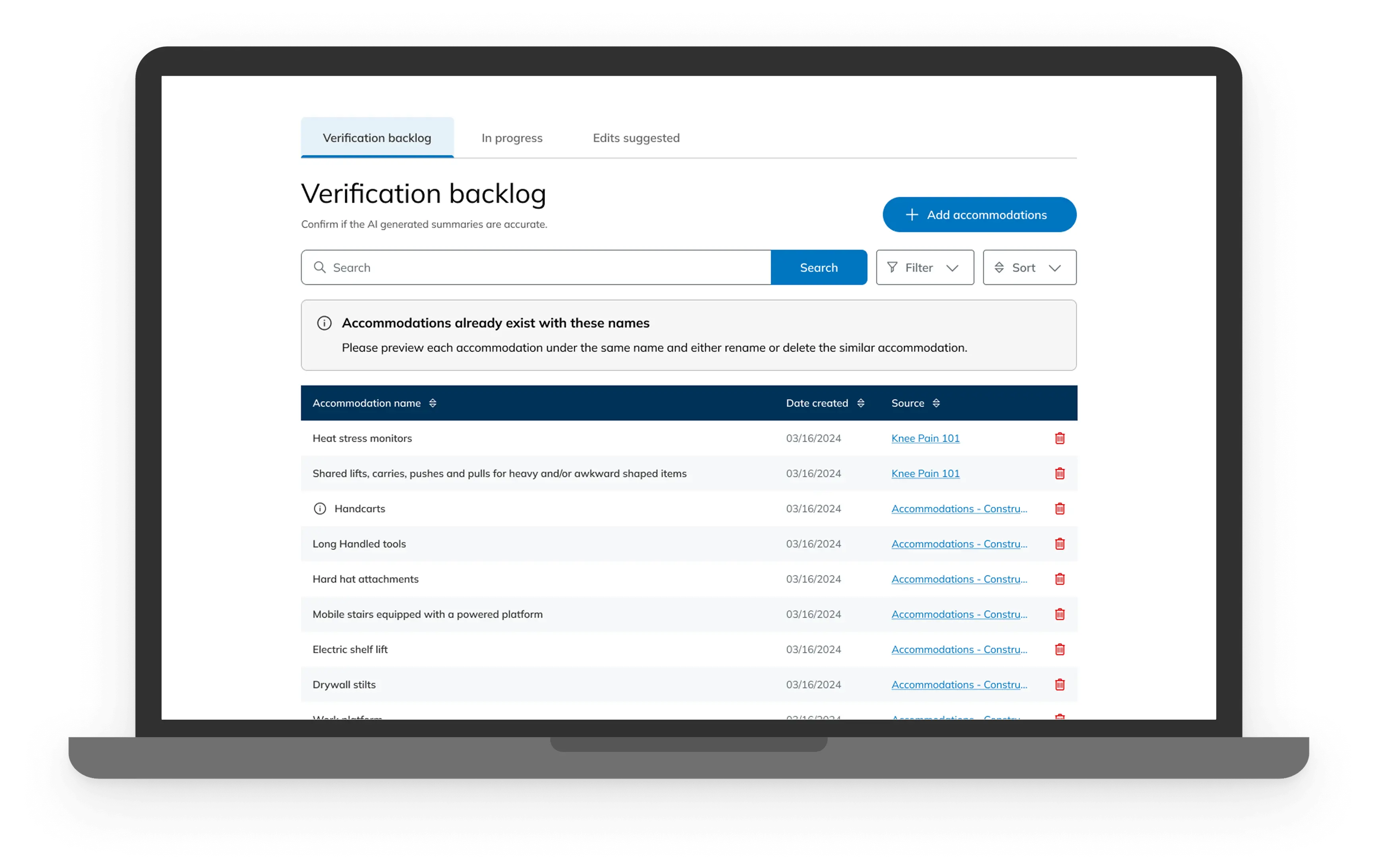
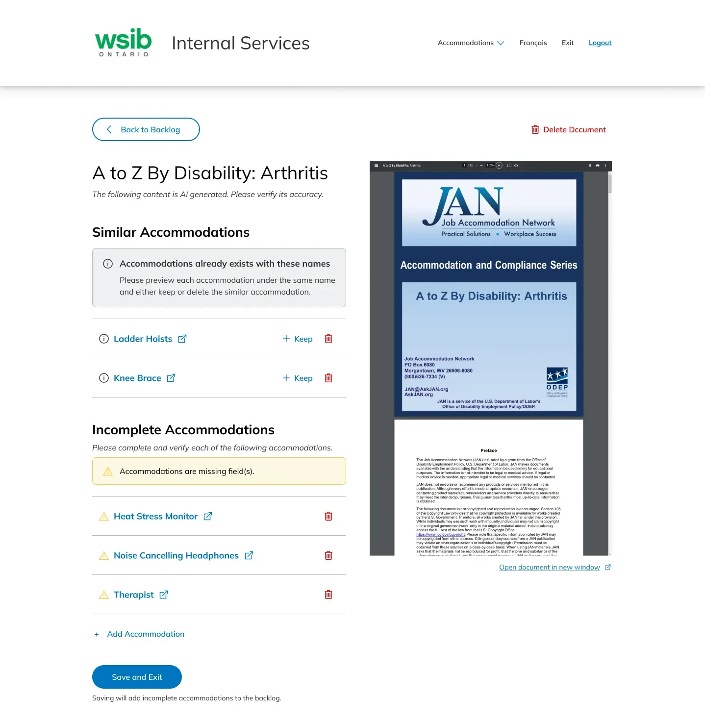
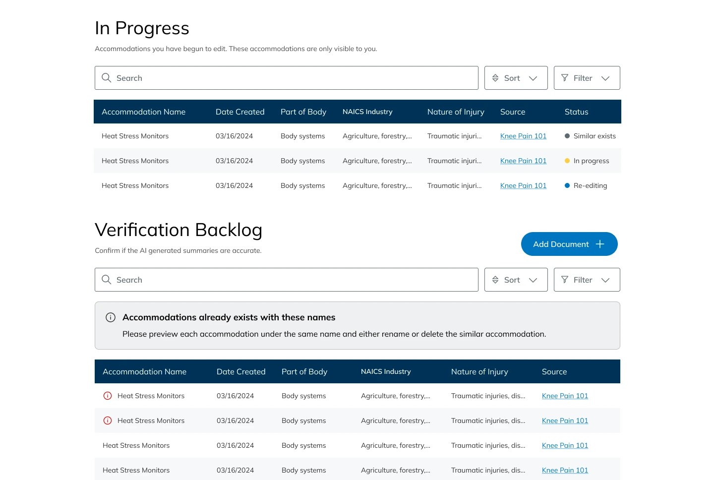
2. Improving Verification Backlog functionality
The Verification Backlog page is where the unverified, saved-in-progress, and edit suggested accommodations go, as well as where users can upload new documents and websites. The design from the previous cohort (V0) only handled unverified accommodations, so the challenge was to distinguish the 3 types of accommodations from each other while also making everything easily accessible on this page.
V0: Only unverified accommodations
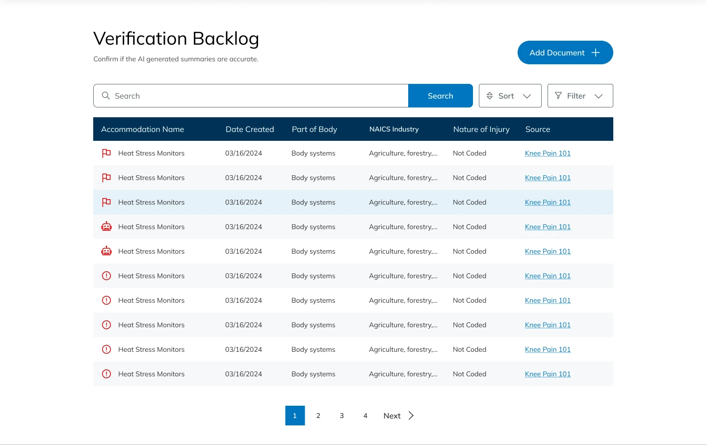
Doesn’t handle saved in progress or edits suggested accommodations
Too many unnecessary columns
Unclear icons
V1: Adding a “Status” column
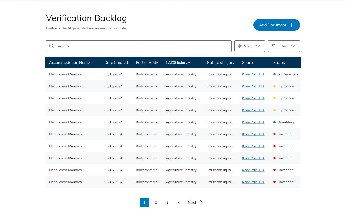
Status column is too complex and doesn’t differentiate enough
Too many unnecessary columns
V2: Separating types into vertical sections
Takes up too much vertical space
Add document CTA is not emphasized
Too many unnecessary columns
Our final iteration: Using tabs to separate the sections
Tabs provide ample segmentation, while keeping everything on this page
Only necessary columns are included
Trash button for easy deleting
Only 1 warning icon per tab
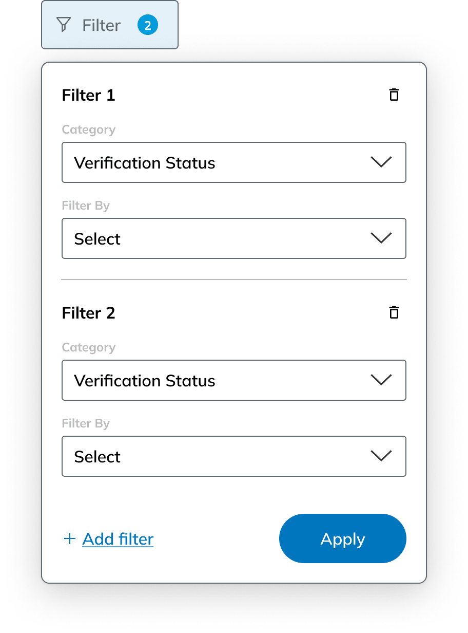
3. Advanced filtering
An essential user need was making filtering quick and easy, especially since some categories had complex subsections. We created various iterations of filter dropdowns and applied filters tags to find the design that most optimized space, speed, and functionality.
Initial design:
V1 design:
V2 design:
Although V1 and V2 got the job done quickly and easily, we felt it was too cramped since many of our filter options have long names and subsection dropdowns. This lead us to V3, which best utilized the screen real estate.
Our final iteration: Slide-in menu
Full height menu provides enough space for long names and subsection dropdowns
Finding and applying filters is simple and efficient
Filter counter for each category
Component Library
Another major task was designing a cohesive component set for our product. Early on, we realized that some of our designs lacked consistency across different pages depending on who worked on it and the leftover progress from the previous cohort.
Thus, we created a unified set of styles and components with clear structure and consistency, ensuring all interactive elements included focus and disabled states to support accessibility and improve the overall user experience.
Buttons
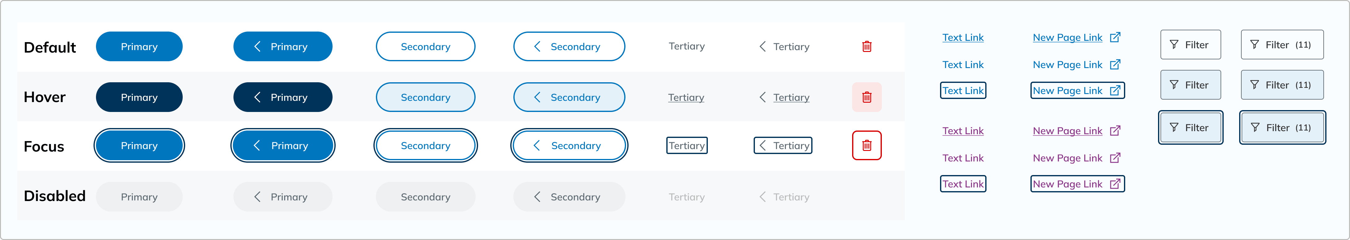
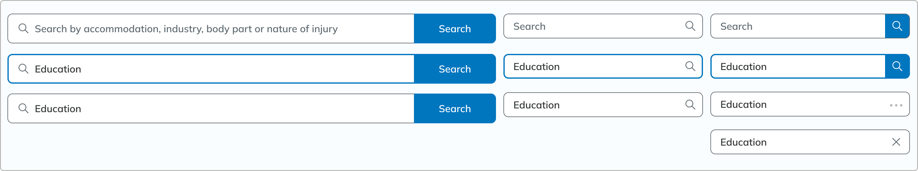
Search bars
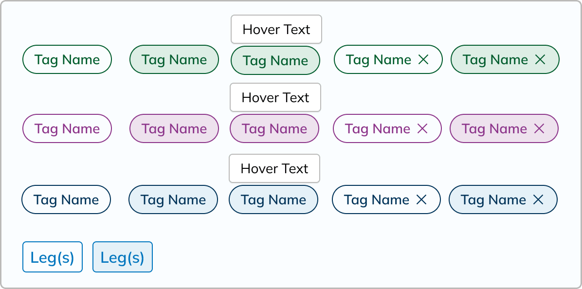
Tags
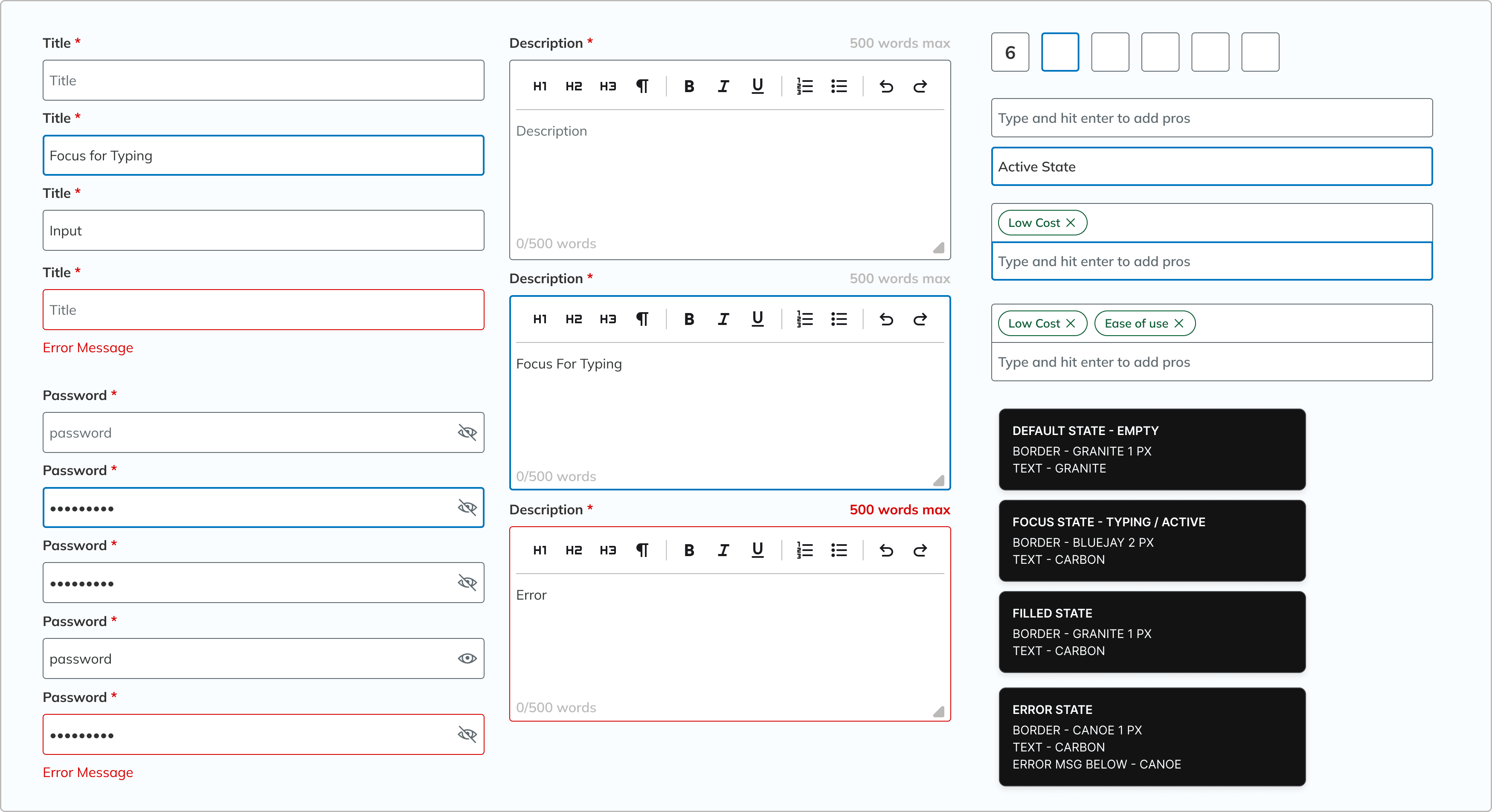
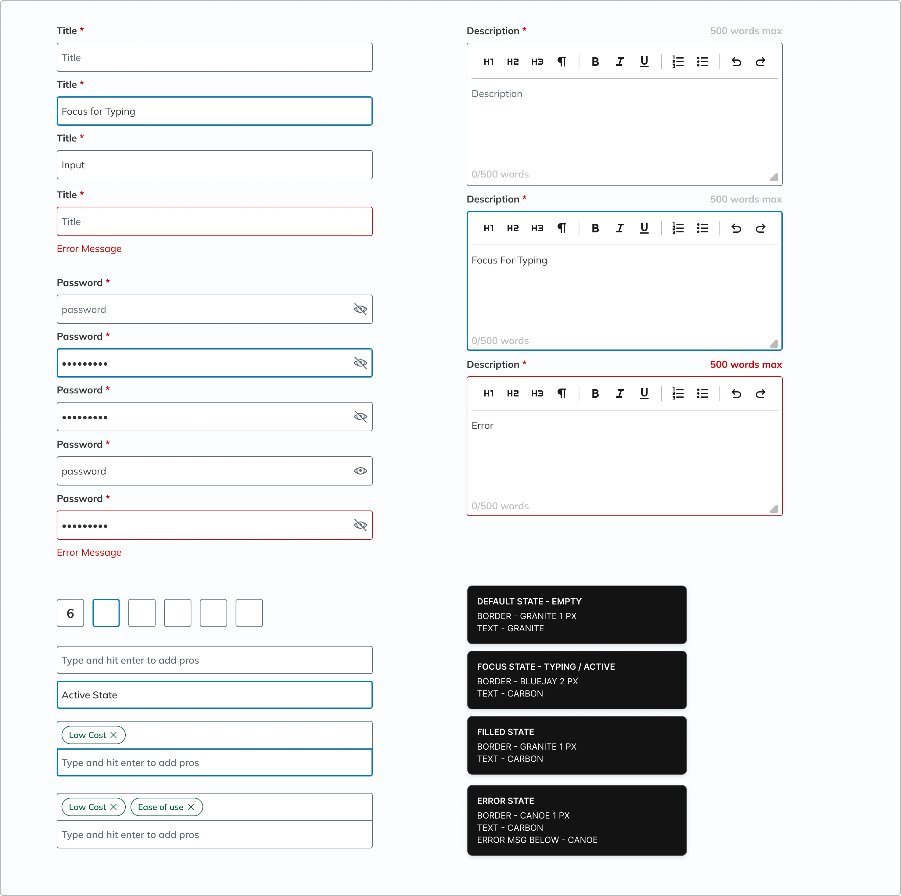
Input fields
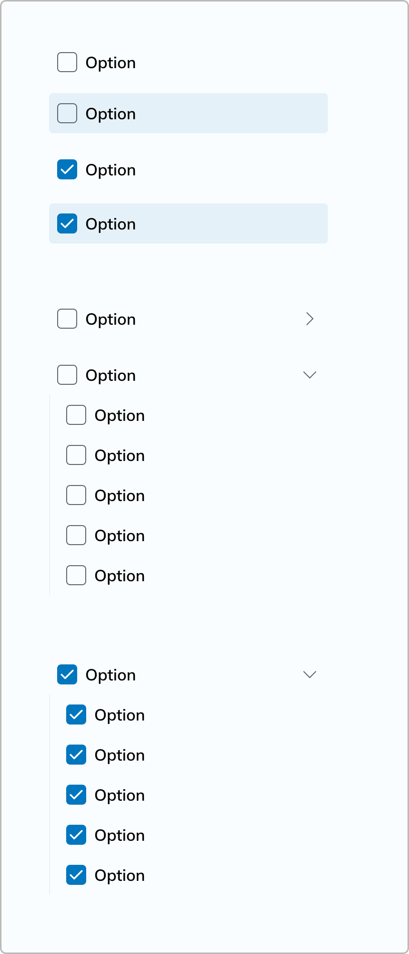
Checkboxes
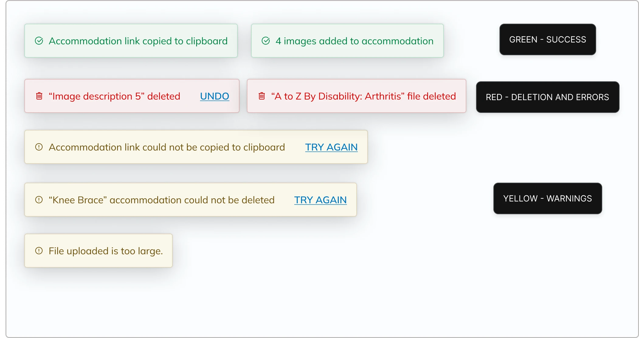
Warnings
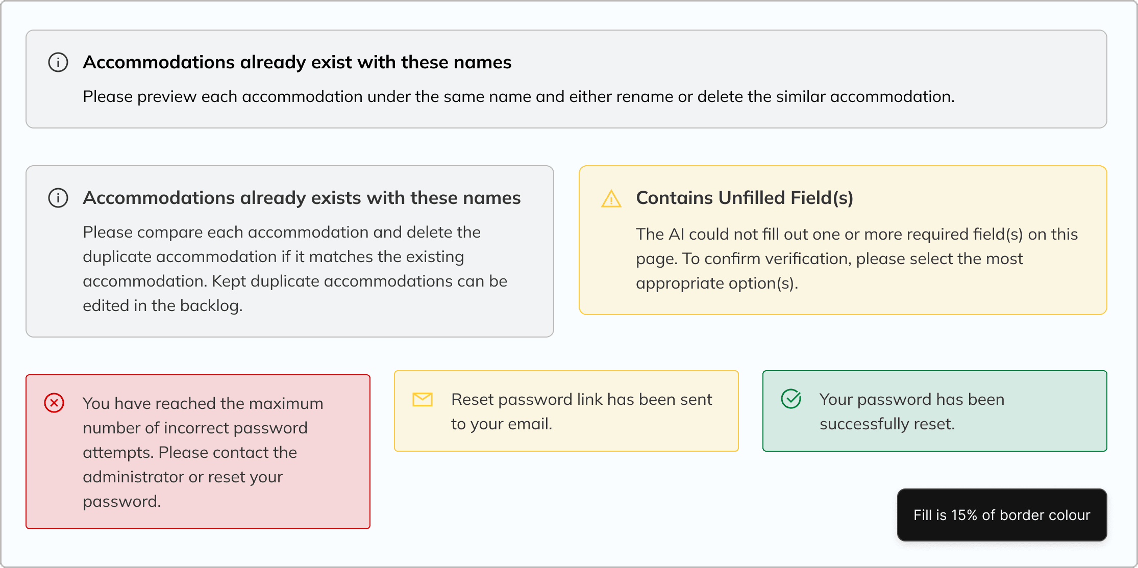
Toasts
Buttons
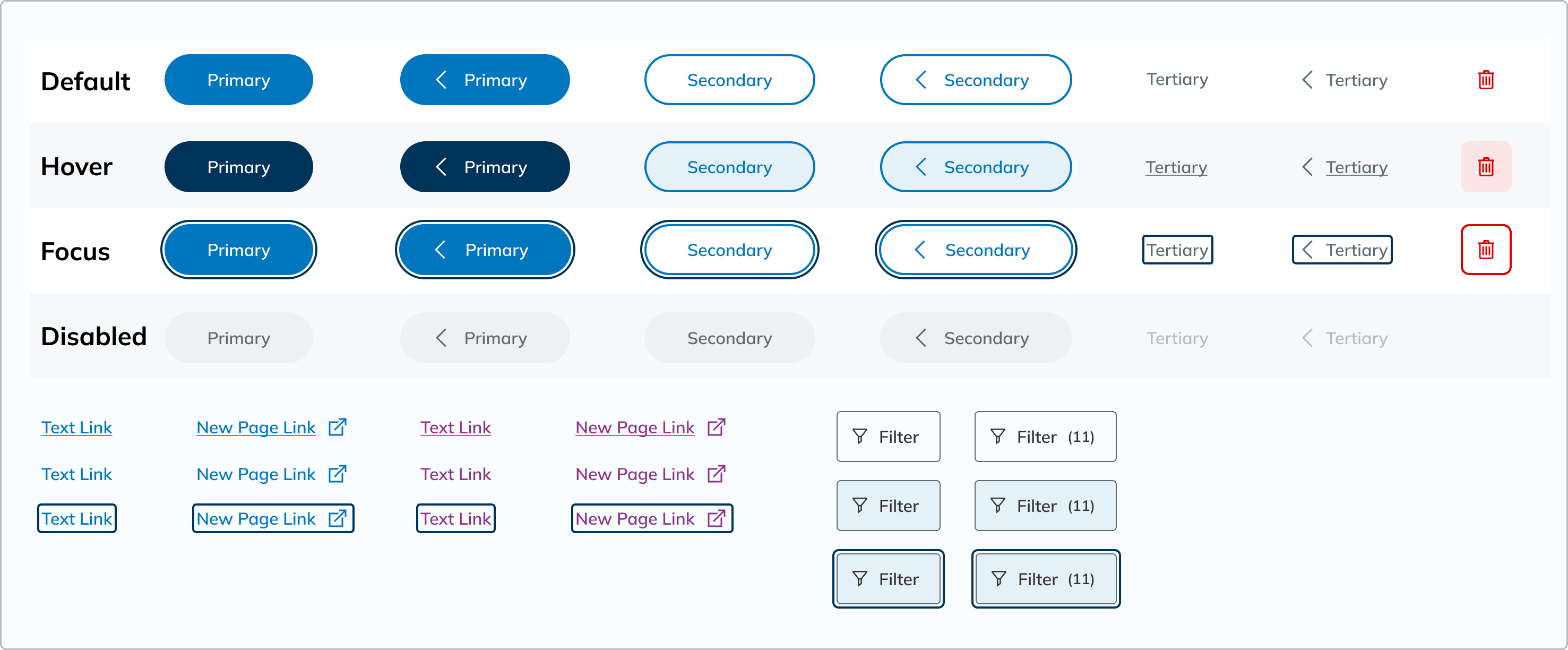
Search bars
Input fields
Warnings
Toasts
Tags
Checkboxes
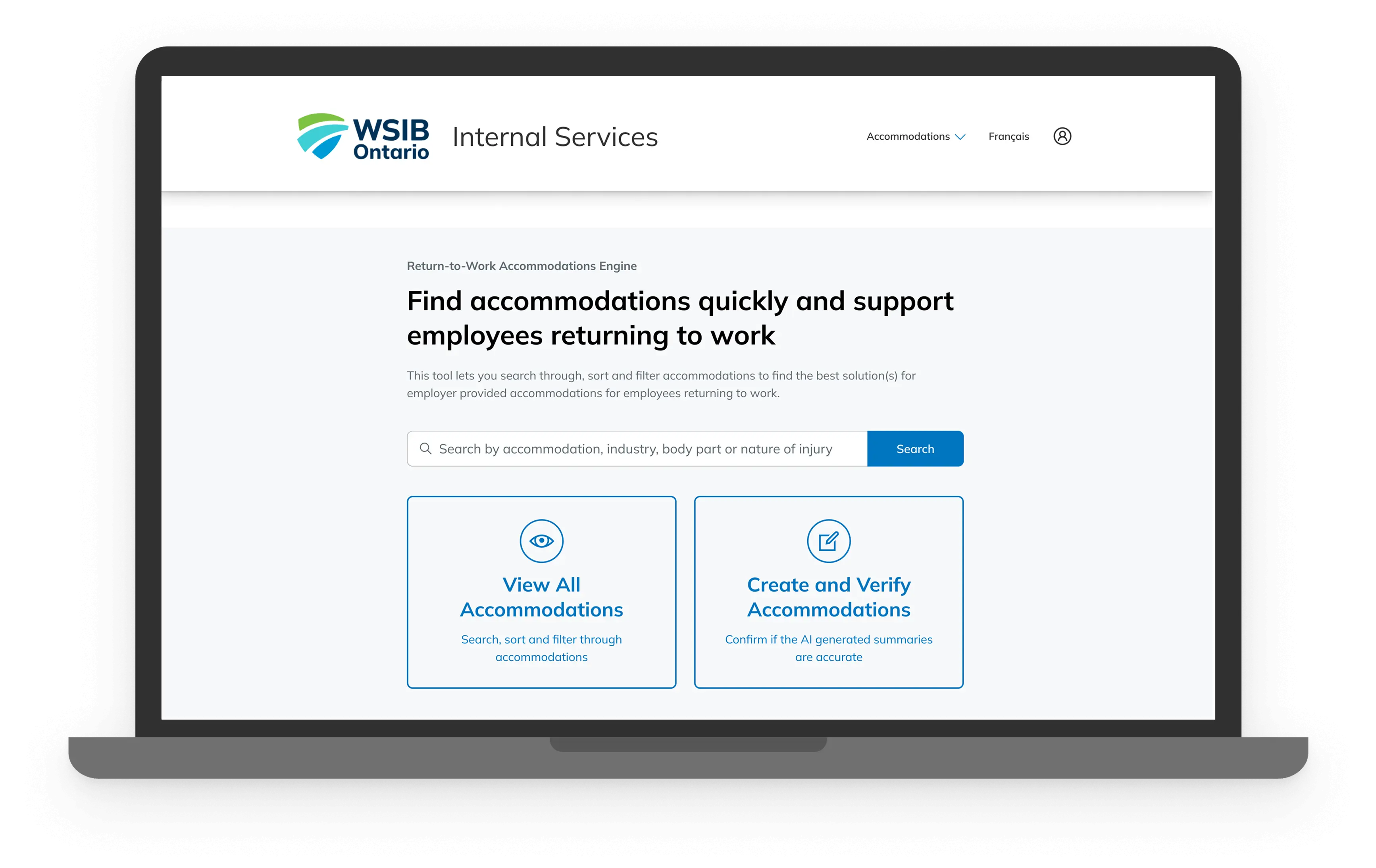
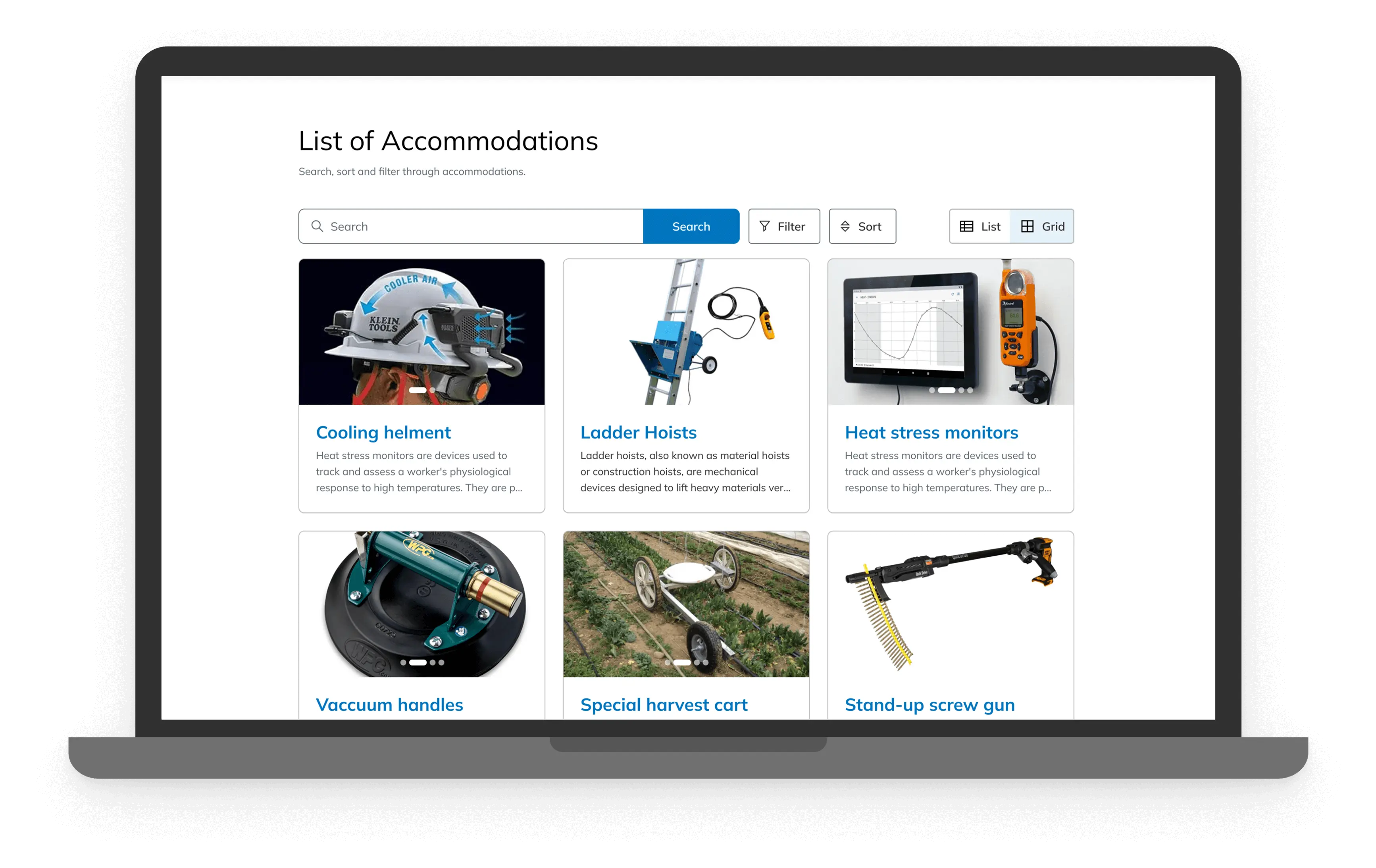
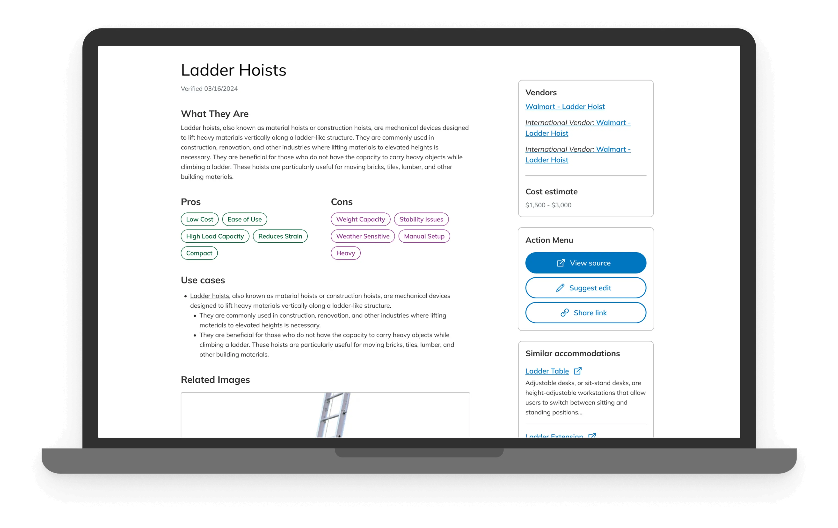
Final Product
The Accommodations Engine
Meet our final product: A simple, friendly tool that takes the stress out of finding and managing accommodations. Everything lives in one place now, with easy filtering, smart AI help, and a design that’s both accessible and nice to look at. It’s organized, intuitive, and made to make RTW Specialists’ lives a whole lot easier.
Edit Accommodation:
Upload Document:
View Accommodation:
List of Accommodations & Filter:
Login:
Our product entered beta testing during my final week of the internship, and we’ve passed it on to the next student cohort to continue the testing phase. And while we didn’t have enough time to fully synthesize the results into measurable metrics, we were able to gather some early testimonials:
“I feel like the RTW team is so neglected at times, this is going to be such a lifesaver for us!”
“You’ve made the [accommodation finding] process 20x faster”
Conclusion
Learnings & Takeaways
Stepping Back is Part of the Process
We kept revisiting the document upload flow over and over again. At one point, it felt like we were stuck in a loop, tweaking the same few ideas without making real progress. It wasn’t until we zoomed out and questioned our assumptions that things finally clicked. Sometimes the best design move is to take a step back.
Building a Solid Design Foundation
Creating a comprehensive component library really made a difference in how we worked. With a consistent set of reusable elements, the design process became much quicker and smoother. It helped keep everything aligned and allowed us to focus on improving the user experience without having to worry about redesigning the basics every time.
Balancing Both Worlds
Working as both a designer and front-end develope gave me a front-row seat to how ideas go from Figma to code. I learned how to design with devs in mind and how to code with the user experience in focus. It also helped me catch the little gaps that often get lost in translation, and build smarter, smoother, more thoughtful handoffs and solutions.